Tag Archive: DAT304


The logo is really coming along and I am nearly there!

I have used a blue colour palette up until this point but as the logo was nearing a final version I thought I would try a green, for the reason that green is a colour people associate with safety (Go at traffic lights, Green ticks on safety signs etc)

This presents a problem as I like the green as well! So I am undecided on which to choose for the final logo… !

The green stands out a bit more and I think has a bit more impact, so at the moment I am veering towards that one, but I will sleep on it for now ! πŸ™‚

In case of printing the logo on other surfaces (For example black and white documents, ability to scan, window stickers etc) The logo needs to be viewable in greyscale.

I have created alternative black and white versions to make sure the logo will happily be applied on any form of advertising:


First versions

I have been doing a bit of experimenting with the logo and from here will simply document my progress in screenshots.

Here I’ve been trying out different background shades and also added in the text. I’m not quite happy with any of these fonts so far so also tried some others;


Shading

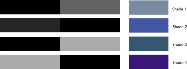
Next up is colouring so I’ve been experimenting with some different shades.


My favourite is shade 2 which is a reflective surface, giving a nice glossy look and the feeling that the service is well polished.


For the colours I’m thinking a blue, but in the back of my head I am also thinking of using green. However, I will start with the following Colour palette and develop my logo from here.

These are NOT the finalised colours, mearly an example of shades that are acceptable within designing a logo.

For example if the logo can work in any of the above shades it will work in any colour.

Here is the first set of symbols I have been messing around with …

Some of the symbols I feel dont give you the correct image for what the service is offering – namely the police hat and builders hat;Β Toughtest is all about improving, fixing the issues and securing websites.

Also, some symbols simply don’t quite fit in visually with the logo.

My favourite from all of the above ideas is the large half spanner, but the padlock also fits quite nicely.

The spanner gives the first impression of ‘Fixing’ and you may also associate it with a hands on and strong approach to fixing things. Also, visually I think it looks the best out of all the symbols I have tried. While the padlock looks visually nice and my business does offer elements of security, it’s not the main focus so for this reason I think I will go with the spanner.

I will now develop this and add my text!

Now I have my business idea the next step is to create some branding. The first thing I want to tackle in my branding is the logo.

Ideally I would like to create some sort of symbol that could be used anywhere whilst still being recognisable without any text.

The symbol could also be used as a ‘badge’ on a website to certify the website has been Toughtested!

So I started thinking about what elements I would like my branding to invoke.

The top words I came up with were Testing, fixing, security and trust. From these words I started thinking about what images I could use to invoke those feelings to people who look at my logo.

Terms for possible imagery

1. Testing

  • Teachers cap
  • Green tick
  • Scientific test tube or beaker

2. Fixing:

  • Spanner
  • Tape
  • Builders hat
  • Workers gloves

3. Security and Trust:

  • Shield
  • Padlock
  • Police hat

I want to be careful here that I don’t use the wrong imagery and confuse people on what the service is actually about.

I like the idea of using a shield with a smaller symbol inside it, combining 2 aspects of my service and therefore giving people a good idea of what the service provides.

I like the idea of having a beaker inside the shield, but this gives an impression of more scientific testing, which Toughttest certainly does not provide!

I will try a few different symbols and see how they turn out!